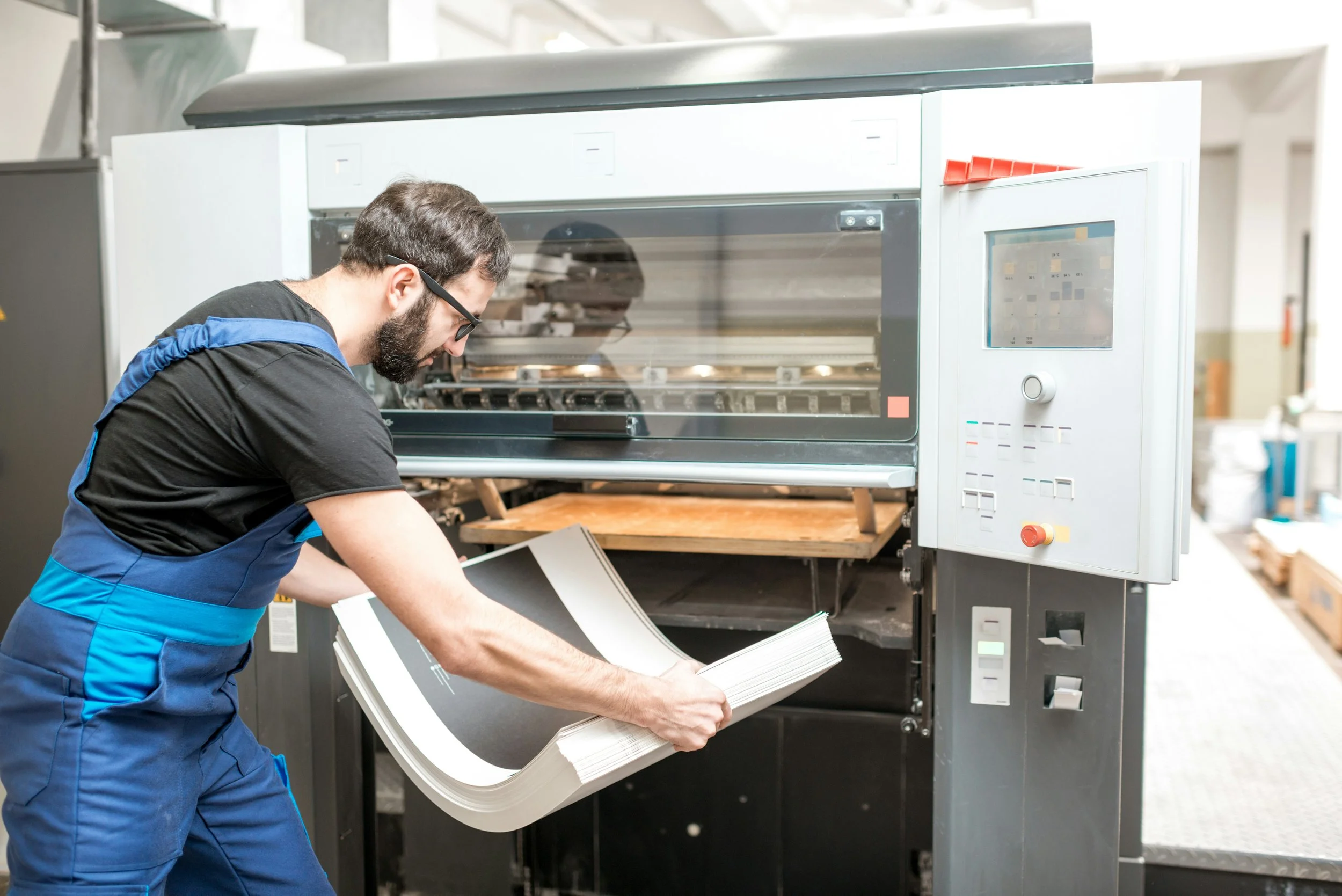
Ask a Printer: Our Team Answers Your Top 5 Print Questions
Every day, the Eastern Press team answers dozens of client questions, ranging from "What paper should I use?" to "Is my file ready to print?" We've collected the top five most-searched and frequently-asked questions this month to give you clear, expert answers that will help you prepare your next project perfectly.
1. What is Bleed and Why Does My Printer Insist I Have It?
Bleed is the area of a document that extends past the edge of the finished printed piece. We insist on it because printing presses aren't perfect. When we cut a large sheet of paper down to your final size (the trim line), there can be tiny shifts, sometimes less than a millimeter.
If your background colour or image stops exactly at the trim line, that slight shift might leave a thin, unsightly white gap at the edge. By extending your design 3-5mm past the edge (the bleed), we ensure that even with minor movement during trimming, your print looks professional with colour running right to the edge.
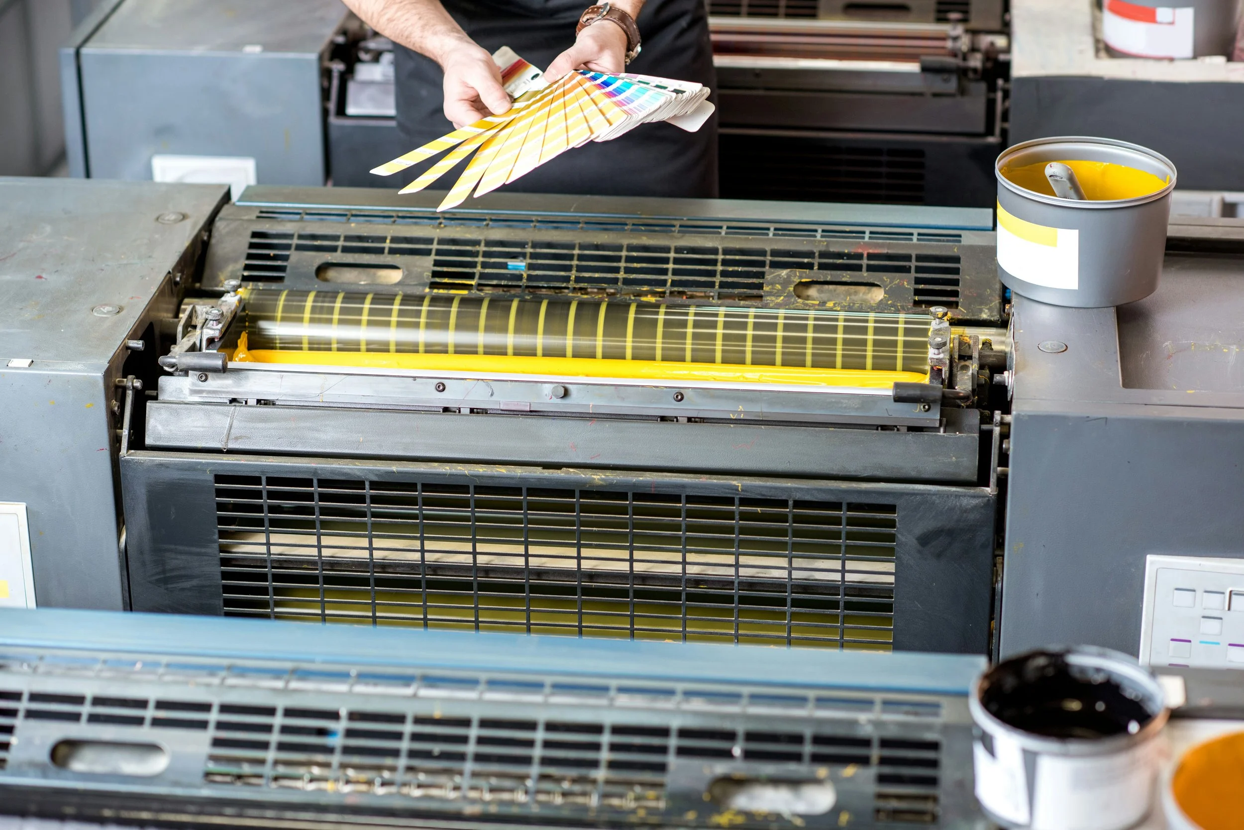
2. Should I Use CMYK or RGB for My Design Files?
The simple answer: Always use CMYK.
RGB (Red, Green, Blue) is for screens (monitors, phones, TVs). It uses light to create colour, resulting in a much broader, brighter spectrum.
CMYK (Cyan, Magenta, Yellow, Black) is for print. It uses ink.
If you design a piece in RGB and send it to us, our software has to convert it to CMYK. This conversion often results in muted or dull colours because ink simply cannot replicate the brightness of light. To avoid disappointing colour changes, set up your design file in the CMYK colour mode from the very beginning.
3. What’s the Best Resolution for Images in Print?
Your images must be 300 Dots Per Inch (DPI) at the final printed size.
Think of DPI as detail. Web images often use 72 DPI, which looks fine on a screen but will appear pixelated, blurry, or "blocky" when printed. For an image to look sharp, crisp, and professional when converted into physical ink, it needs that higher concentration of detail, 300 DPI. If your image is only 300 DPI at a postage stamp size, trying to enlarge it to a poster will result in low quality.
4. What's the Difference Between Coated and Uncoated Paper Stock?
This choice drastically changes the feel and look of your final product.
Coated Stock has a seal (often clay-based) applied to it. This prevents ink from soaking in, allowing the colour to sit brightly on the surface. It provides a crisp finish and can be glossy, silk, or matte. Ideal for brochures, photos, and high-impact marketing.
Uncoated Stock is porous and allows the ink to soak in slightly, giving the print a softer, more muted look. It’s easier to write on and feels more natural or textural. Ideal for letterheads, note pads, and high-end stationery.
5. Why Does My Digital Proof Look Different from the Printed Product?
This is a very common issue! The colours you see on your computer screen (lit by RGB light) will virtually never match the ink on paper (viewed under ambient light).
Your monitor is likely uncalibrated, meaning its colour settings are unique to your machine. For mission-critical jobs, the only way to guarantee colour accuracy is through a physical press check on a calibrated proofing device or, ideally, at our facility. If you notice a drastic change, always stop and talk to us before approving a final digital proof.