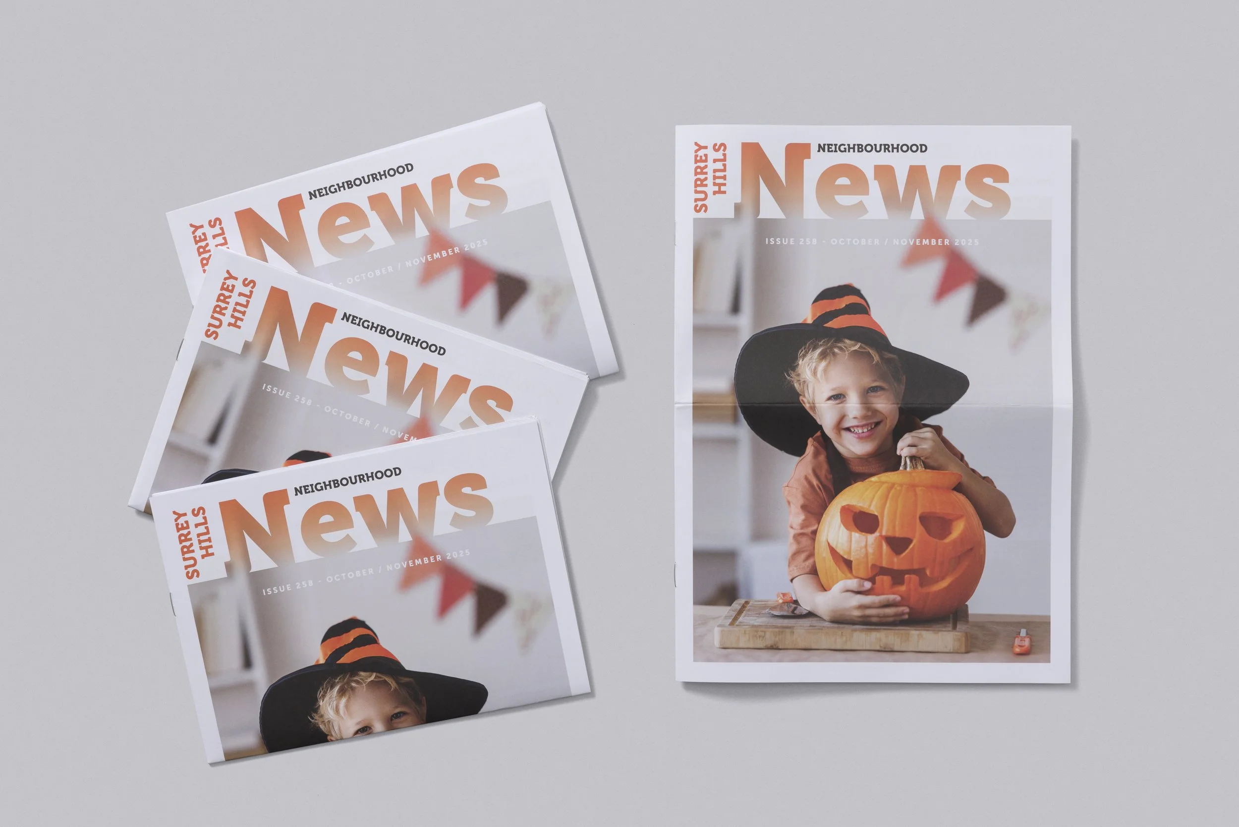
Hyper-Local Hype: Making Your Newsletter the Most Anticipated Read of the Month
For local councils, community groups, and neighbourhood associations, cutting through the daily noise is a constant challenge. Emails get deleted, and social media posts scroll by. However, a high-quality, targeted print newsletter delivered directly to the letterbox remains the ultimate tool for guaranteed community engagement and building local trust.
A great local newsletter shouldn't feel like a government notice; it should feel like a piece of local news that residents choose to keep. Here are three strategies to transform your publication from routine reading into the most anticipated item in the mailbox.
Focus on Content That Connects
The secret to high readership is making the content personal and unique to the suburb. Move beyond planning updates and maintenance alerts and focus on human interest stories that make people feel proud of their community:
Resident Spotlights: Profile a local volunteer, a long-serving shop owner, or a resident who has achieved something noteworthy. This immediately personalizes the publication.
The Utility Page: Dedicate a section to highly useful, evergreen information, such as local event calendars, council contact directories, or bin collection schedules. Make it easy to cut out and stick in the fridge.
Local History Nuggets: Share a fascinating, little-known historical fact about the suburb. This encourages curiosity and pride in the area.
Design for “Keepability”
If a newsletter looks cheap, it signals that the information inside is disposable. Investing in quality design and printing encourages readers to keep the issue on their coffee table or notice board for longer.
Clean and Readable Layout: Use simple, bold headings and ample white space. Prioritize large, vibrant photography over small, dense blocks of text. The design should be inviting, not intimidating.
The Paper Choice: Opt for a paper stock that feels substantial. A heavier, smooth paper suggests professionalism and importance. It ensures the colours of your photos truly pop and prevents ink from bleeding through.
Branding Consistency: Ensure the logo and colour palette match all other community touchpoints. Cohesion builds immediate brand recognition and trust.
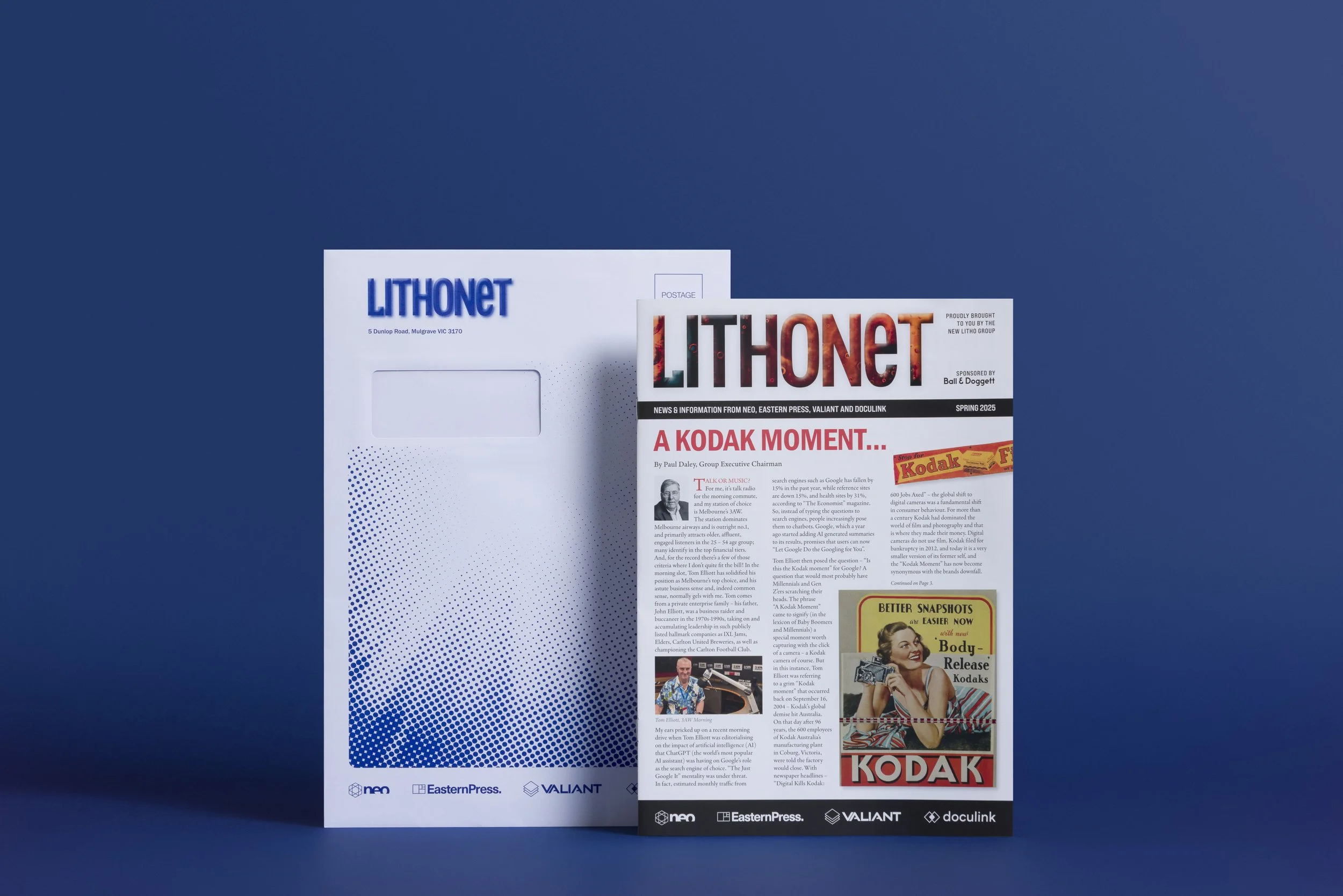
Distribution That Guarantees Reach
The most significant advantage of a physical newsletter is its guaranteed reach. Unlike digital communications, which are subject to email filters and algorithm changes, a printed newsletter arrives directly into every letterbox in your defined area.
Partner with a local expert like Eastern Press who can handle high-volume printing and coordinate reliable, targeted distribution across specific suburbs. This ensures that every household receives the update, minimising complaints about being "out of the loop."
By prioritising engaging content, high-quality design, and reliable distribution, your community publication will stop being just a routine notice and start being the powerful, trusted voice of your neighbourhood.