Visual Hierarchy: Using Print to Define Your Product Tiers
In marketing, we spend a lot of time talking about "Visual Hierarchy" the way a designer uses size, colour, and layout to guide your eyes to the most important information first. But in commercial printing, there is another layer to this strategy: Tactile Hierarchy.
If your business offers different levels of service, such as "Standard," "Premium," and "VIP" packages, your printed materials should help customers feel the difference. When the physical quality of your collateral mirrors the price point of your service, you remove the "guessing game" for the client and make the upgrade feel like a logical, desirable choice.
Why Physical Tiers Matter
Imagine a high-end gym or a private members' club. If the "Basic" and “Elite” membership cards look and feel identical, the Elite member loses a sense of status, and the Basic member has no physical incentive to upgrade.
By using different paper weights and finishes, you create a tiered experience that reinforces your brand’s value at every level.
Level 1: The "Essential" Tier (Professional and Functional)
For your entry-level products or high-volume flyers, the goal is clarity and professionalism.
The Finish: A clean Matte or Silk finish. It looks professional and is easy to read, but doesn't add the cost of specialized coatings.
The Weight: A standard 150-200 GSM paper. It’s sturdy enough to feel "real" and avoid looking like junk mail, but light enough to be cost-effective for large runs.
The Message: "We are reliable, accessible, and high-quality."
Level 2: The "Premium" Tier (The Subtle Step Up)
When a client moves into your mid-range or professional tier, they expect a more "intentional" feel.
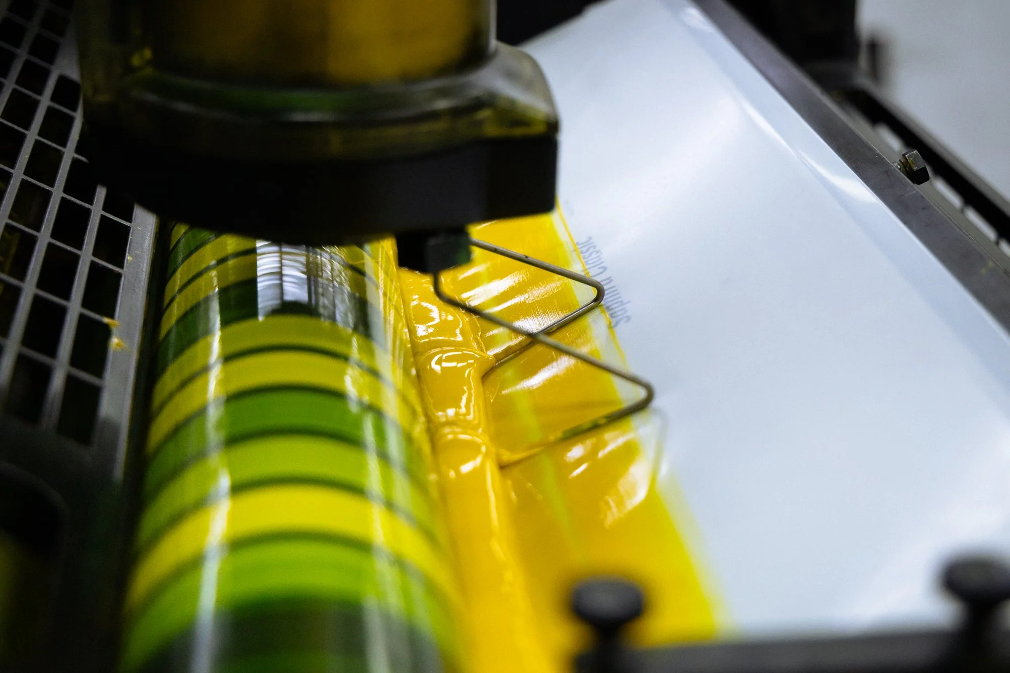
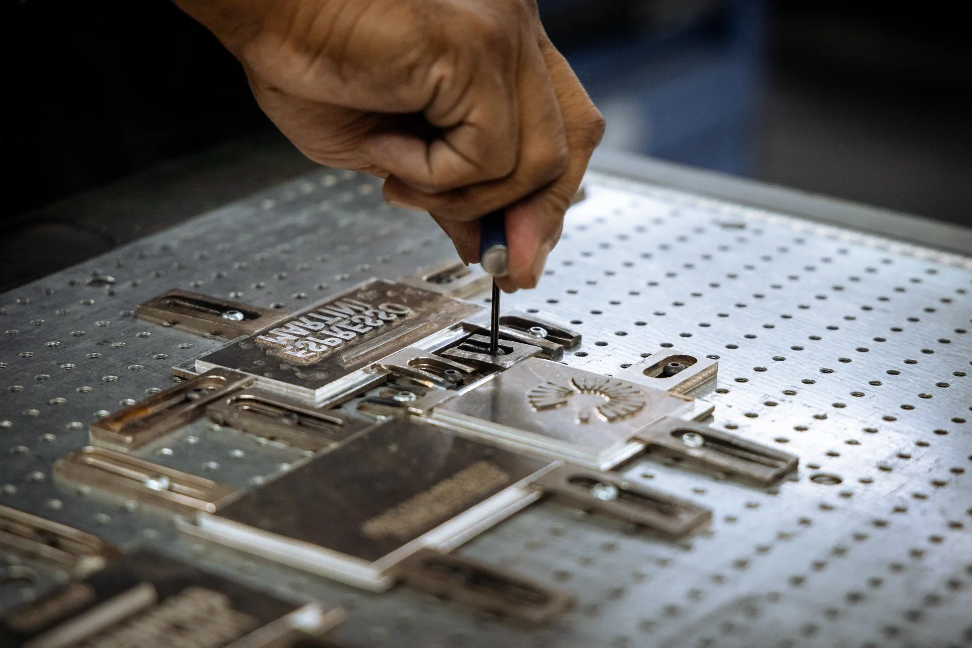
The Finish: Add a Spot UV coating to your logo. This creates a glossy contrast against a matte background that catches the light. It’s a "secret" detail that signals a higher level of care.
The Weight: Move to a 250-300 GSM cardstock. It has more "snap" and feels more substantial in the hand.
The Message: "We are specialised, attentive, and worth the extra investment."
Level 3: The "VIP / Elite" Tier (The Sensory Statement)
For your highest-priced services or exclusive partnerships, the collateral must feel like a "gift" or an "artifact."
The Finish: This is where you use Foil Stamping (Gold, Silver, or Copper) or Embossing. These aren't just colours; they are three-dimensional features. You might also use a Soft-Touch lamination that feels like velvet.
The Weight: Go for the "Heavyweights" 350-450 GSM or even a "Duplexed" card (two sheets glued together).
The Message: "This is an exclusive, world-class experience. Every detail has been considered."
Helping the Customer Choose
Using print finishes to differentiate tiers isn't just about looking "fancy." It’s a psychological nudge. When a customer holds a VIP brochure that feels twice as thick as the standard one, their brain automatically registers that the service inside is twice as valuable.
At Eastern Press, we help our clients design "Marketing Suites" that grow with their business. By choosing a consistent design but varying the finishes, you keep your brand recognisable while making it very clear to your customers that you have a "Premium" option waiting for them.
Is your collateral telling the right story about your pricing? Let's look at how we can add a little more weight to your most valuable services.