Retro Revival: Why Vintage Print Aesthetics are Modern Brand Gold
In a digital landscape dominated by sleek gradients, flat design, and highly polished corporate imagery, standing out often means looking backward. The current surge in popularity for retro print aesthetics isn't just a fleeting trend; it's a strategic move by modern brands seeking to convey authenticity, warmth, and a comforting sense of nostalgia that purely digital formats struggle to replicate.
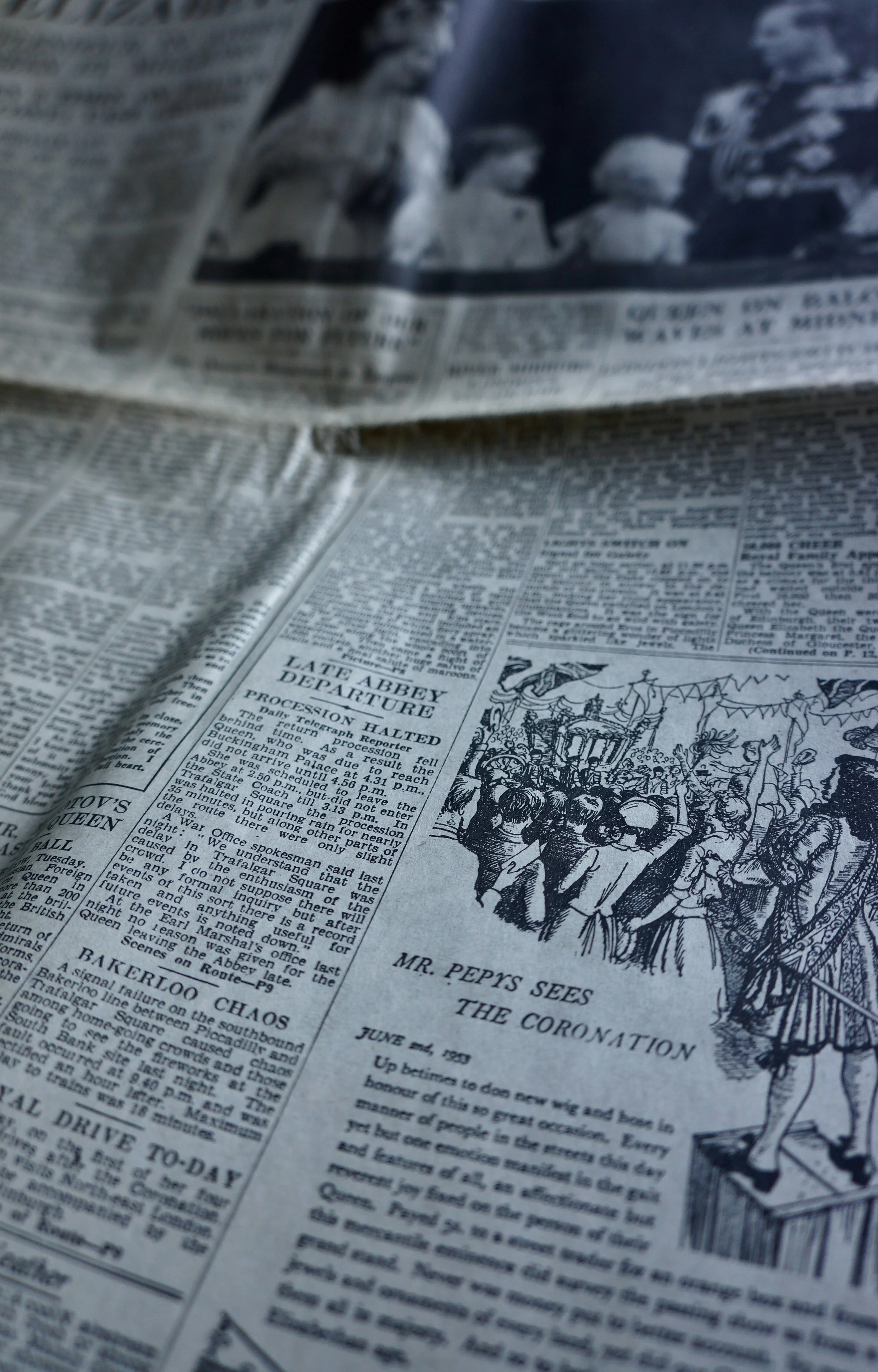
This "Retro Revival" leverages the power of print to tap into shared cultural memories. Styles reminiscent of mid-century advertising, classic paperback covers, or 1970s album art inherently feel trustworthy and characterful. Why? Because they are associated with a less complicated, pre-digital era. When a brand uses muted colour palettes, distressed textures, or the deliberate imperfection of a letterpress or risograph style, it subtly communicates that they value history and craftsmanship over fleeting technological novelty.
For Eastern Press clients, this trend offers a potent opportunity to combine the charm of the past with the precision of modern printing.
Firstly, texture and tactility are crucial to nailing the retro look. Print finishes are indispensable here. A digital screen can only show you a vintage texture; print allows you to feel it. Choosing a heavier, uncoated stock can instantly lend a premium, earthy, and tactile feel reminiscent of old stationery. Furthermore, modern digital printing technologies, such as variable data printing, can recreate the slight misregistration or dot matrix patterns of older printing methods, but with flawless, contemporary execution.

Secondly, the right colour and typography selection seals the deal. Brands are moving away from hyper-vibrant RGB screens in favour of:
Muted Tones: Earthy greens, burnt oranges, mustards, and dusty blues that evoke the 1950s and 60s.
Bold Contrast: Using high-contrast, chunky sans-serif fonts reminiscent of old movie posters or public signage.
These design choices, when combined with specialist print elements like spot UV coating (to mimic the sheen of old vinyl) or embossing (to give a title that iconic, debossed look of a hardcover book), transcend mere imitation. They create a deliberate, memorable brand artifact.
In a world where consumers are fatigued by generic, disposable digital content, a physical piece of marketing that looks and feels like it has history is perceived as having greater inherent value. The Retro Revival proves that print is not merely a medium for delivery; it is a design tool capable of establishing a deep, emotional connection that positions a modern brand as genuine, classic, and built to last. It is the perfect marriage of nostalgia and new technology, making a statement that truly stands out from the digital noise.