The Second Dimension: How Tactile Textures Drive Premium Brand Value
In the world of digital marketing, brands are flat. No matter how high-resolution the image or how vibrant the video, the experience is trapped behind a cold sheet of glass. This creates a "sensory gap" that commercial print is uniquely positioned to fill.
By moving beyond the visual and into the tactile, brands can leverage the "Second Dimension", the sense of touch. Techniques like embossing, debossing, and specialised textures aren't just decorative flourishes; they are strategic tools that communicate luxury, authority, and quality before a single word is read.
The Psychology of Haptics: Touch is Believing
The science of haptics (the sense of touch) reveals that our brains are hardwired to associate physical weight and texture with value. In behavioural economics, this is often linked to the "Endowment Effect", the idea that when we touch an object, we subconsciously begin to feel a sense of ownership over it.
When a client holds a business card with a deep, crisp debossing, or runs their fingers over a brochure with a linen texture, their brain registers a "premium" experience. This tactile feedback creates a lasting memory that is significantly stronger than a purely visual one. In a competitive market, being the brand that "feels" better is often the difference between being remembered and being recycled.
Strategic Tools of the Tangible
How do you translate brand values into physical sensations? Eastern Press utilises several key techniques to add "Stopping Power" to commercial collateral:
Embossing & Debossing: By raising (embossing) or pressing (debossing) a logo or pattern into the paper, you create a play of light and shadow. It adds a literal third dimension to the page. It is the "Braille of Branding," inviting customers to touch the logo, which increases the time they spend with the piece.
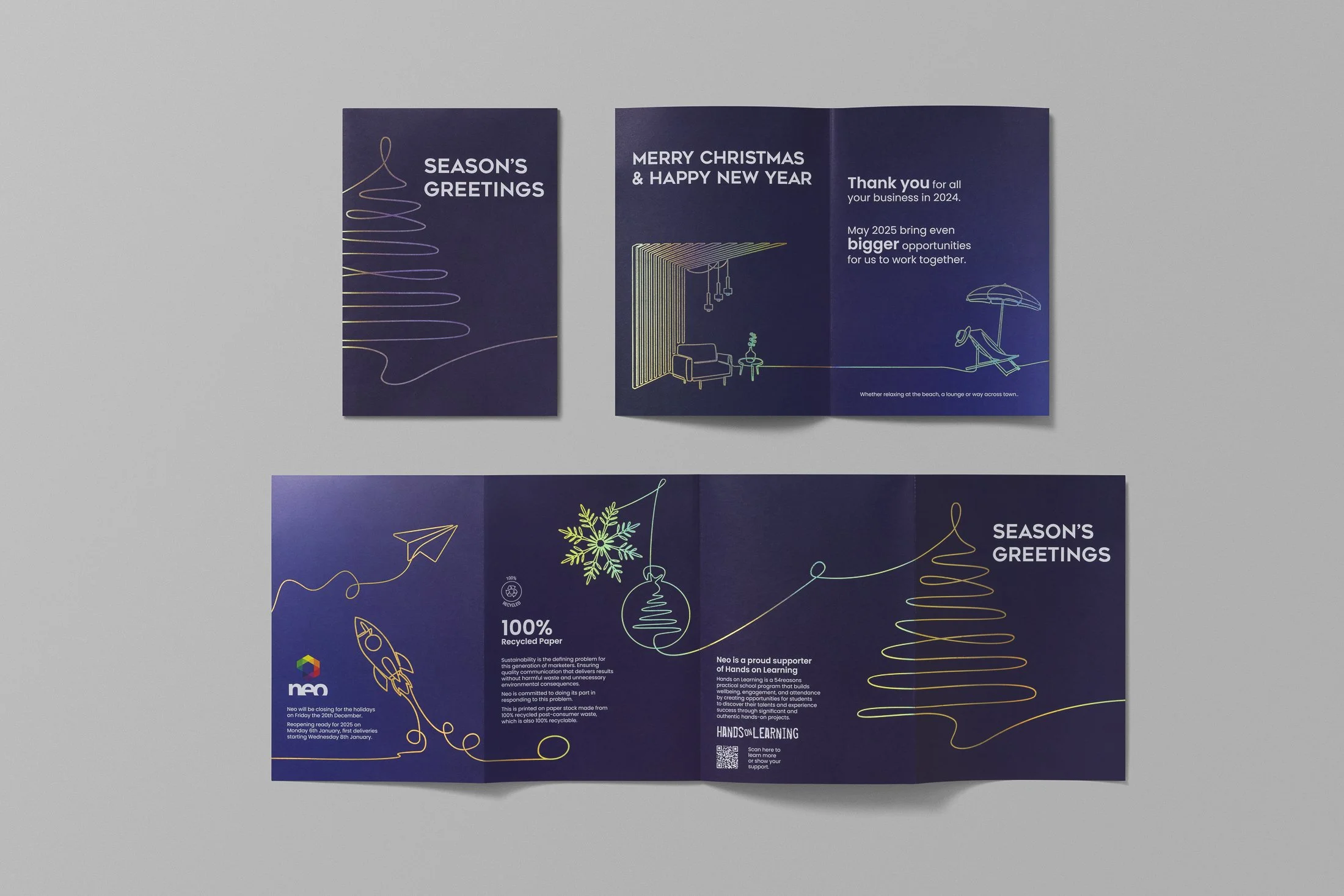
Foil Stamping: By using heat and pressure to transfer a thin layer of metallic or pigmented foil to the paper, you create a brilliant, reflective finish. It offers a level of luminosity that visual printing cannot replicate. It is the ultimate signal of exclusivity and high value, perfect for making a logo or title catch both the light and the eye.
Soft-Touch & Velvet Coatings: These coatings transform standard paper into something that feels like fabric or skin. The contrast between a "soft-touch" background and a high-gloss "Spot UV" logo creates a sensory surprise that keeps the reader engaged.
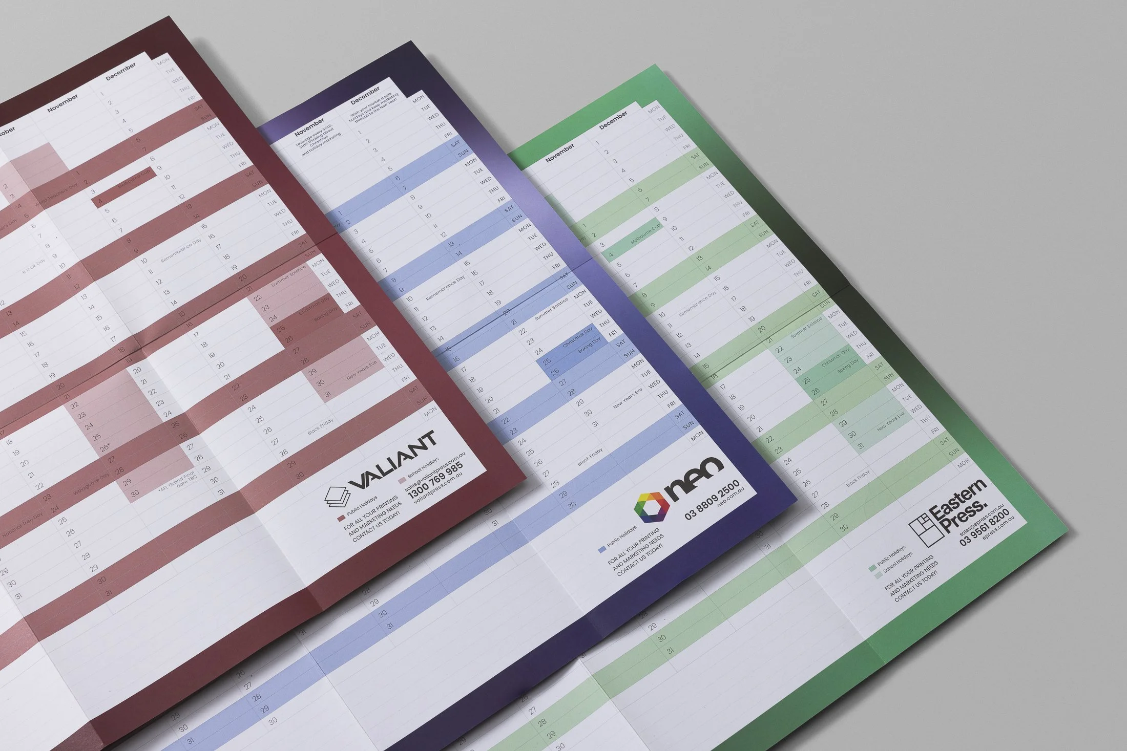
Specialty Substrates: The paper itself is a message. Using a raw, recycled stock with a visible grain signals sustainability and authenticity. Conversely, using a heavy, metallic-flecked cardstock signals high-tech innovation or luxury.
The ROI of the "Touch Test"
For many businesses, the concern is that specialised finishes add cost. However, the true metric to consider is the Cost Per Response.
In high-stakes B2B sales or luxury retail, the goal of a printed piece is to project a "High-Value" image. If a flimsy, smooth brochure suggests a budget service, it may actually be the more expensive option because it fails to convert the lead. A textured, embossed piece that survives the "Touch Test" positions your brand at the top of the market, justifying a higher price point and fostering immediate trust.
Conclusion: Don't Just Show Your Brand, Let Them Feel It
As the digital world becomes more crowded, the physical world becomes more valuable. By incorporating texture and dimension into your print strategy, you aren't just handing over information; you are handing over an experience.
At Eastern Press, we help our clients choose the right textures to match their brand’s soul. Whether it’s the rugged feel of an outdoor brand or the smooth, velvet elegance of a legal firm, we ensure your brand leaves an impression felt as much as it’s seen.